
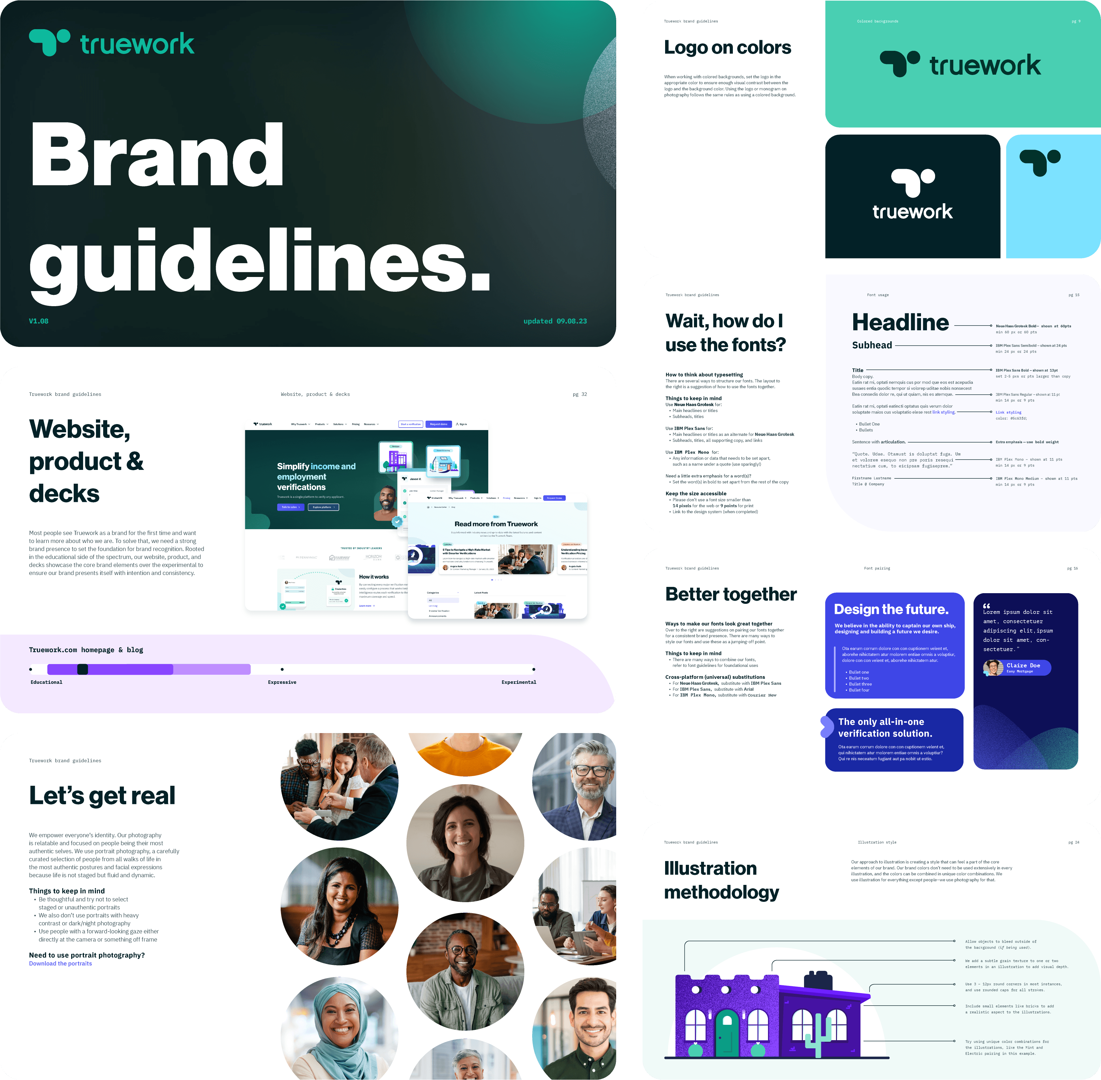
Truework had just closed a Series C and was shifting focus toward enterprise. The brand
hadn't kept up. I led the refresh end to end, repositioning the visual language to feel credible at
that level while keeping enough warmth to stay approachable.
Corporate Memphis was out. Real photography for people, vector work for everything else. Built a brand
spectrum as a practical reference, a visual guide for designers and non-designers alike to understand
how the brand shows up across different channels. The logo system was rebuilt from scratch, with
sub-brands and ERG logos redesigned to have distinct personalities while still reading as a family,
all considered across every scale from favicon to banner. Icons got a scaling framework too, from
simple utility to expressive marketing visuals. The whole system was built for scale: Figma component
libraries, color tokens, and a self-serve Google Slides template so the broader team could stay
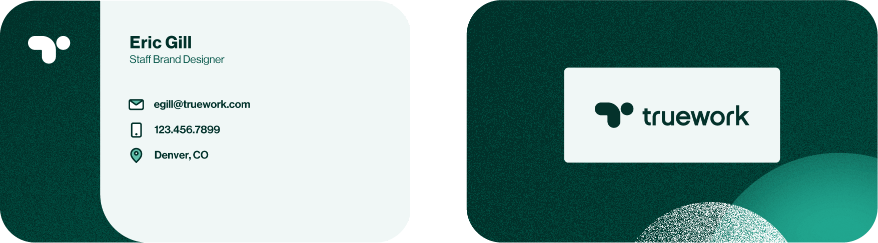
on-brand without a designer in the room. The refresh extended into physical work as well: business
cards, swag, custom playing cards, and company kickoff branding.
Brand Strategy Visual Identity Logo Design Creative Direction Presentations Employer Branding Icon System Design System Typography Color Swag Design Print Illustration
The icon got a weight increase for legibility and was redrawn to sit in better proportion with the logotype. Once you see it you can't unsee how much better it reads.
 Before
 After
After
The guide covers everything from logo usage and typography to color palettes, illustration methodology, photography direction, icon frameworks, and a brand spectrum that helps anyone on the team understand how much creative range they have for a given application. I built it as a living document, not a rulebook, with direct links to the asset library and Google Slides so the team could actually find and use what they needed without coming to me every time.
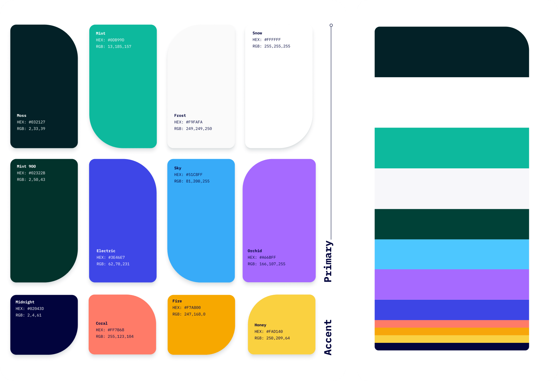
A full custom color system built around a deep green primary and a range of named accent colors, each with their own shade scales. Every pairing was checked against AA accessibility standards, and the guide includes a pairing chart so anyone using the brand knows exactly which combinations work and why.
All shapes originate from the parts of the logo. Built on see-through and grain gradient textures, they work as solid colors, photo containers, or repeating background elements. A small toolkit that punches above its weight.

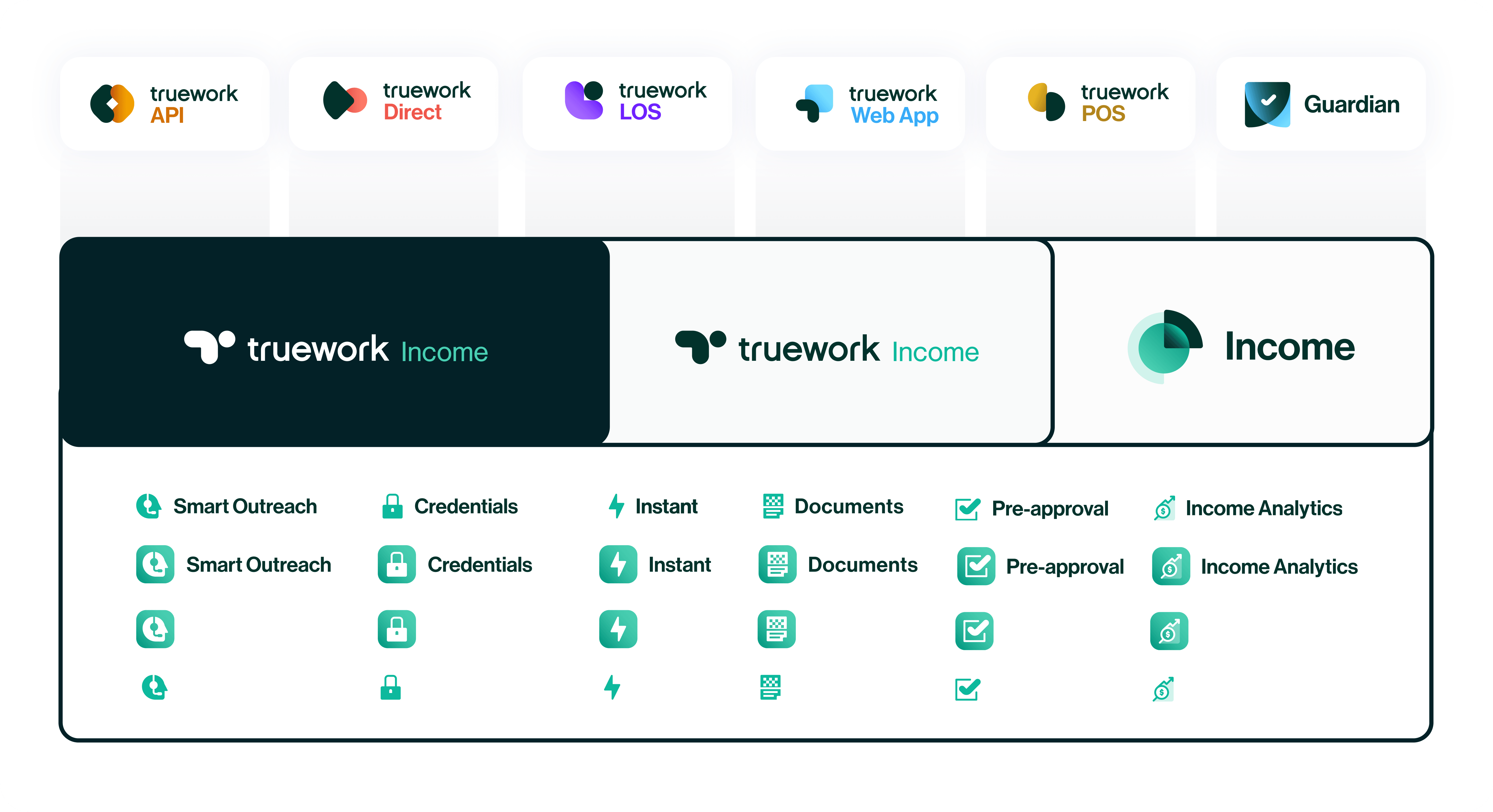
Two styles, one system. Visual icons built on a 96x96 grid for marketing and callouts, and product icons on a 24x24 grid that hold up at 16px. A colorized version of select icons was also created for the website refresh, giving them a little extra personality where it counted.
Each mark was built using the shapes and framework from the Truework icon. The shared foundation kept everything feeling like a family while still giving each value and group room to be its own thing.
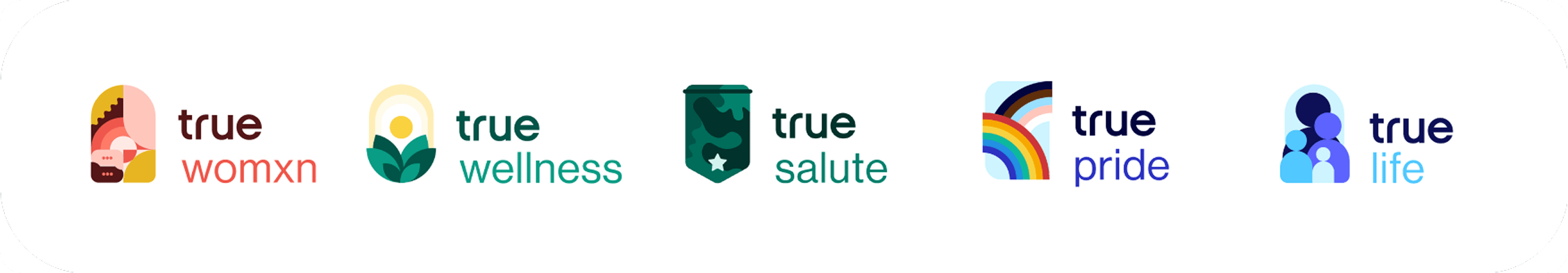

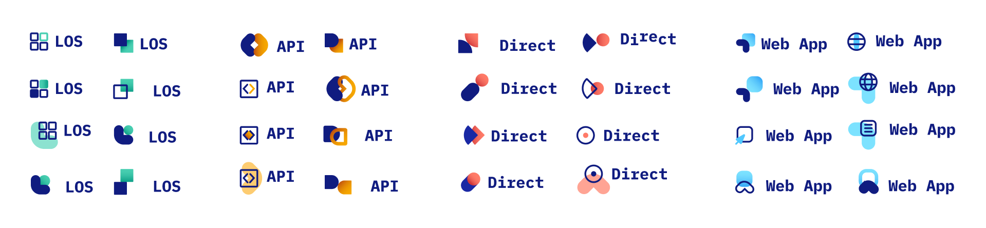
Truework had a growing family of platforms and verification methods, each needing its own mark. Some lived in the product, others gave marketing something polished to build campaigns around. The challenge was giving each one a distinct identity without losing the thread back to the parent brand. A few explorations are included to show a little of what went into getting there.
A chance to put the refreshed brand in someone's hand. Simple, considered, and worth keeping.
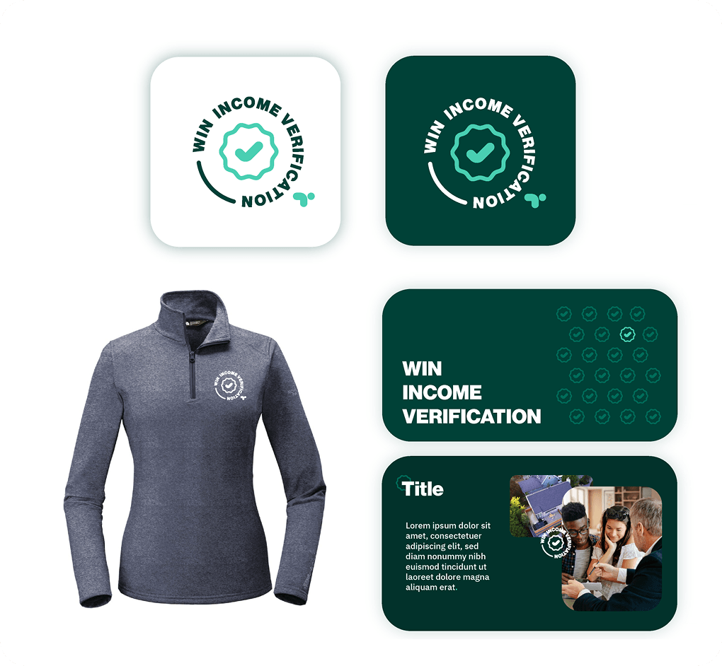
Each year I owned the full creative for Truework's company kickoff. This theme leaned into verification success, which meant leaning into green. A bold badge shape and a repeating pattern built from the logo became the foundation for all the event materials.
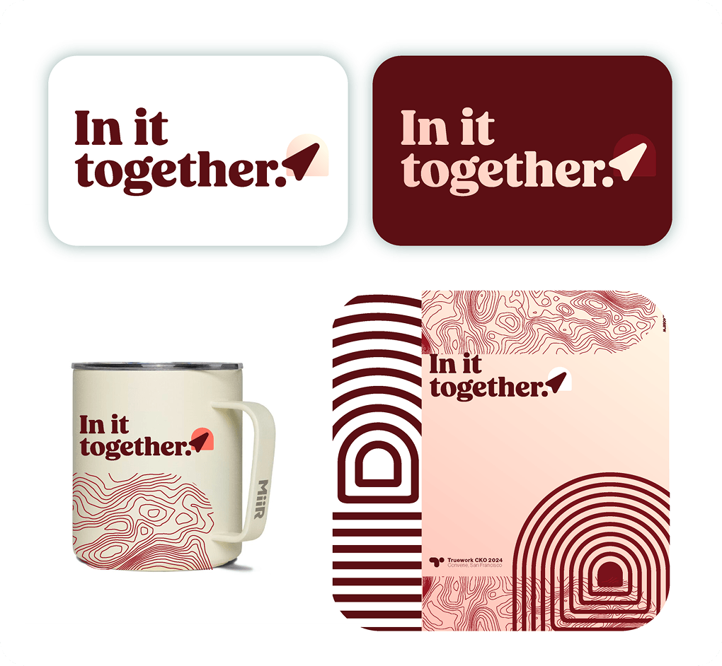
The company kickoff concept came from the outdoors: hiking, camping, team activities. A compass element from the logo anchored everything, with a topo map texture running through it. That same language carried into the swag, making the whole thing feel like a kit for getting outside.
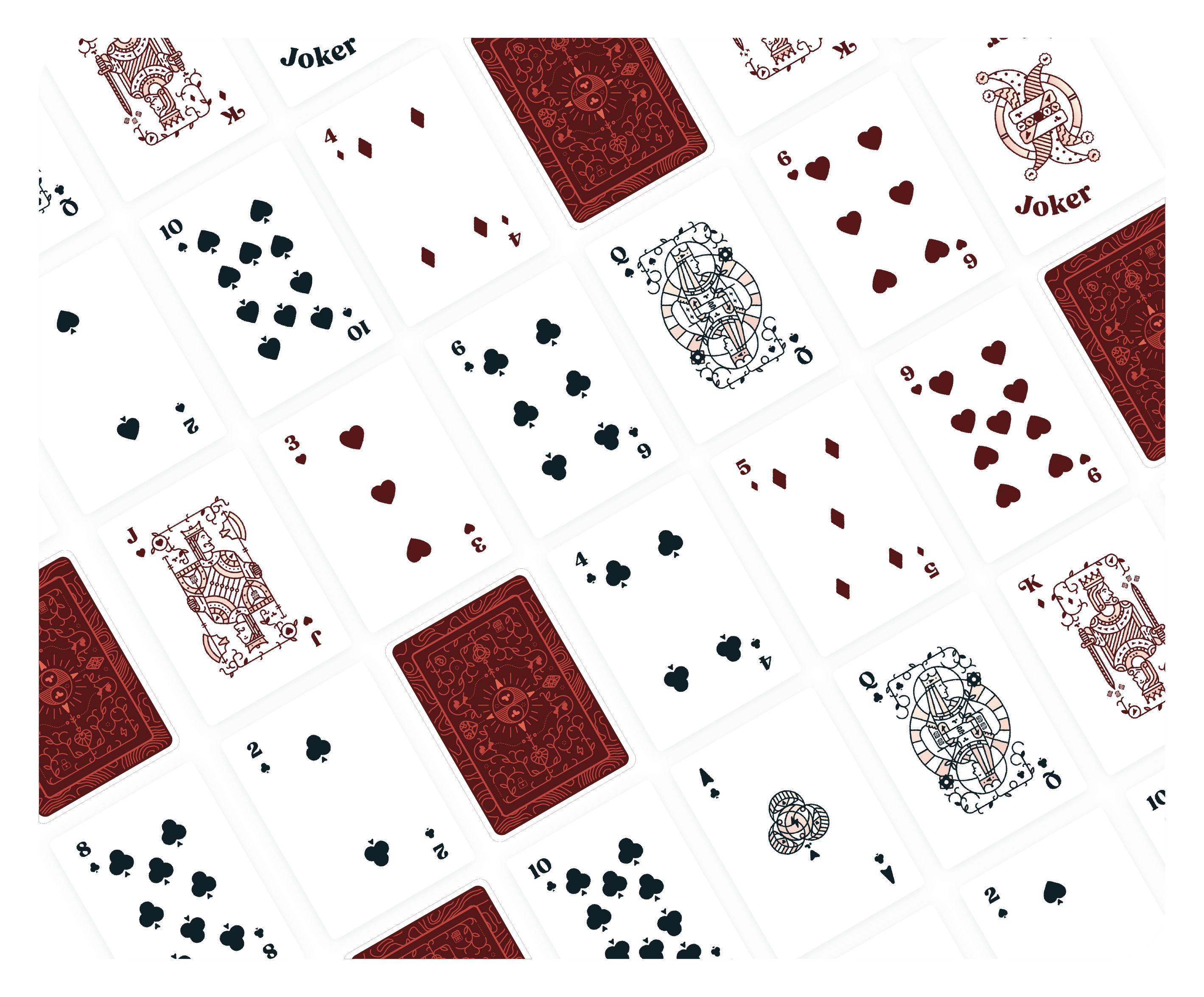
Each card was fully designed to be unique, tying back to the company values and the In It Together theme. The kind of thing people actually hold onto.
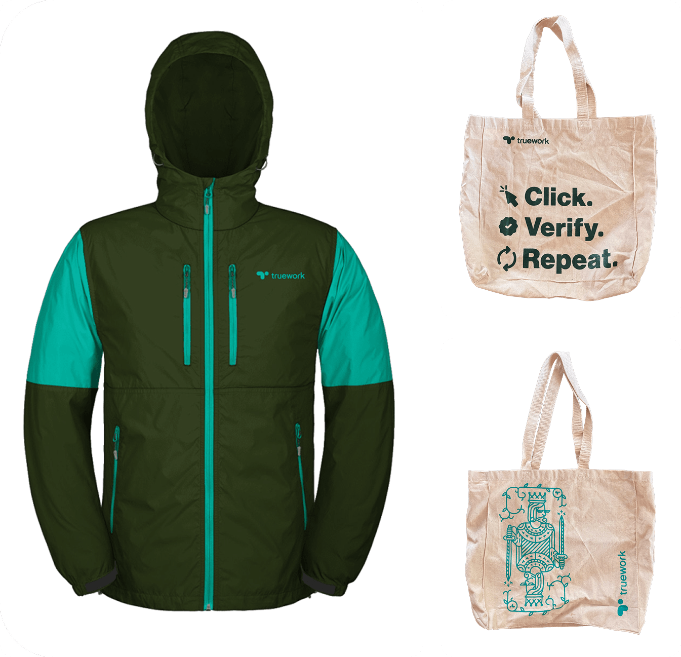
A fully custom rain jacket gifted to customers, with Truework's colors and logo. The kind of swag people actually wear. Then there are the totes, which were the real crowd-pleasers at events. One with a killer tagline, one with a card-carrying king in Deal With It glasses. People lost it over that one.
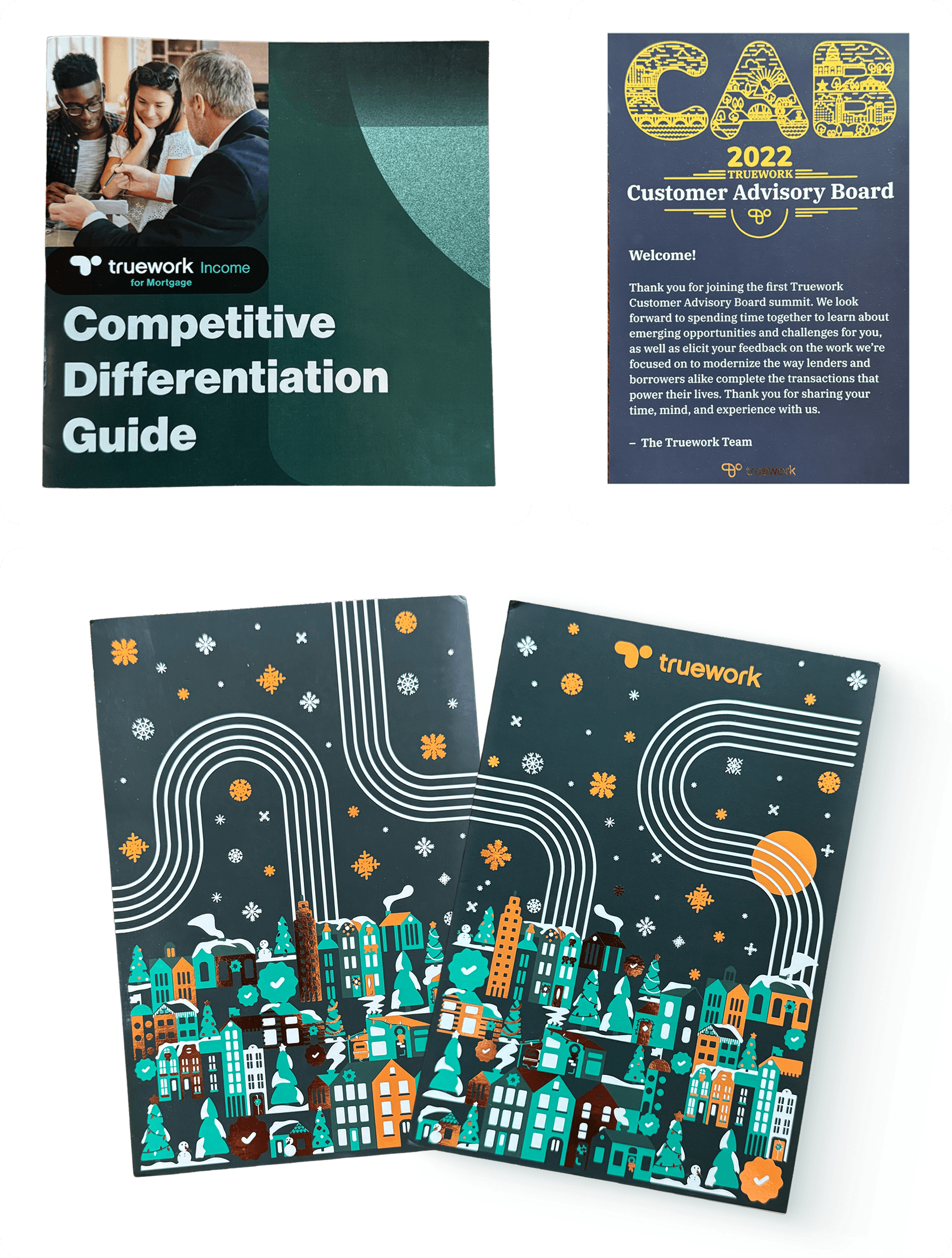
Three pieces: a competitive differentiation guide, a Customer Advisory Board mailer, and a holiday card featuring a hand-illustrated homescape with falling snow and selective rose gold foil on the decorations.
 in Colorado.
 Eric Gill ©
