
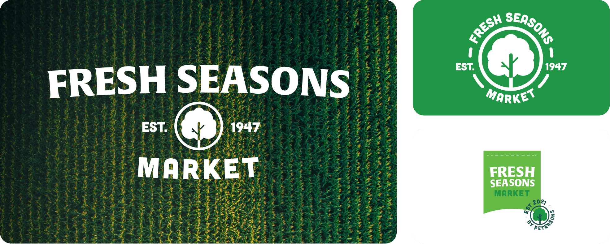
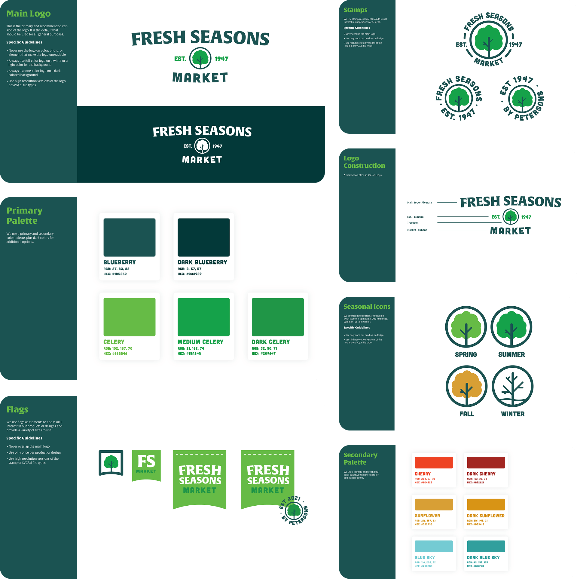
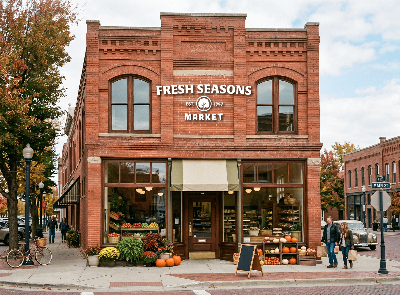
An old coworker reached out to develop a new logo for her family's grocery store,
expanding into a new storefront in Gothenburg, NE. They wanted something rooted in what came before
but revitalized enough to pull in a younger crowd. The new store also had a large tree in the center
of the produce area, so that had to be part of it.
I designed the logo to feel like a vintage farm store the locals would be proud of, with a color
palette modern enough to catch the eye of anyone passing through.
Brand Strategy Logo Design Creative Direction Typography Color System
 in Colorado.
 Eric Gill ©
s